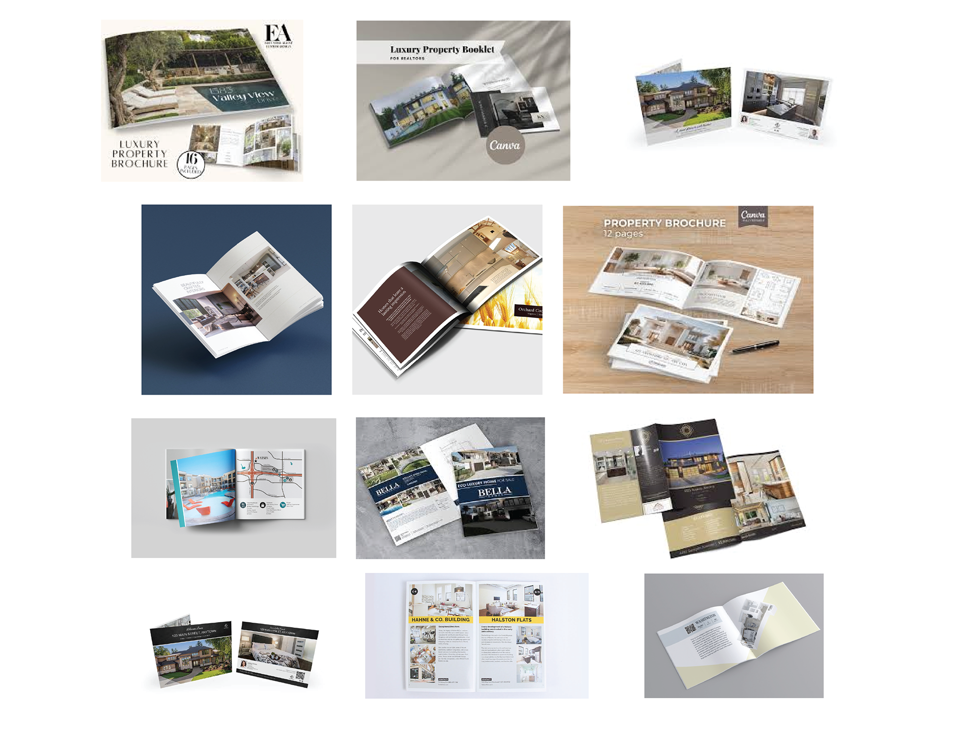
The Royal Belmont is a two-page magazine spread designed as part of an interview project, highlighting the luxury, charm, and community feel of the Boston-based apartments. I developed a mood board and mind map to guide the creative direction, then built the layout in InDesign with a focus on clean typography, refined spacing, and an elegant, welcoming aesthetic.
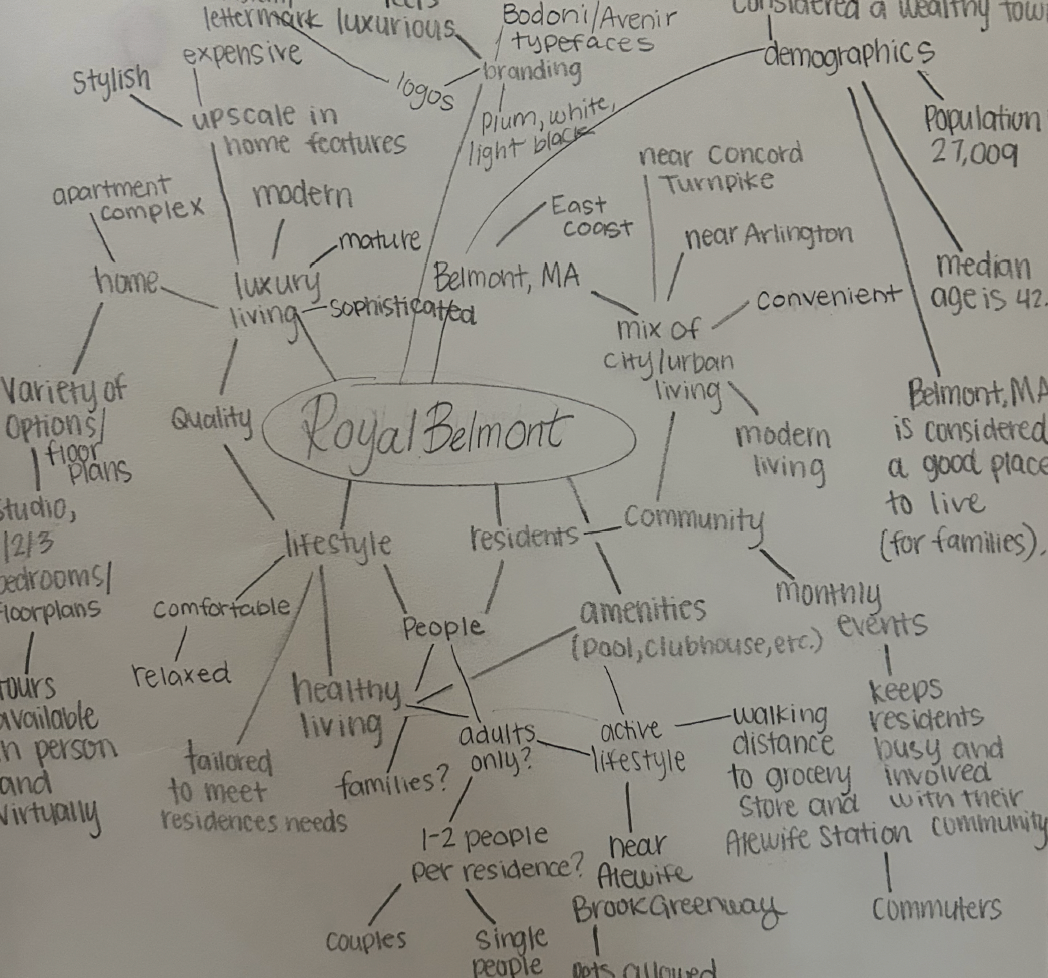
Mind map and Sketches
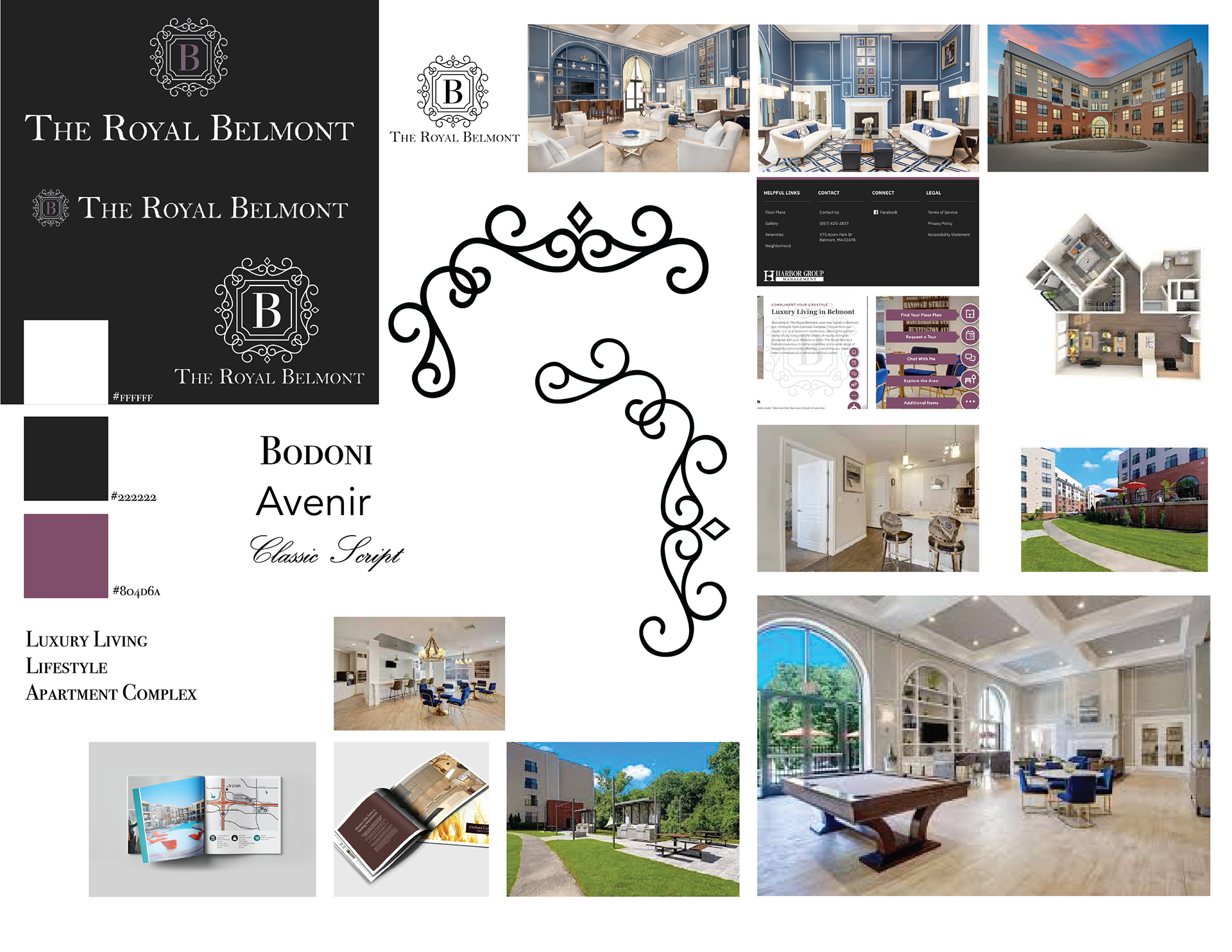
Mood board and Examples
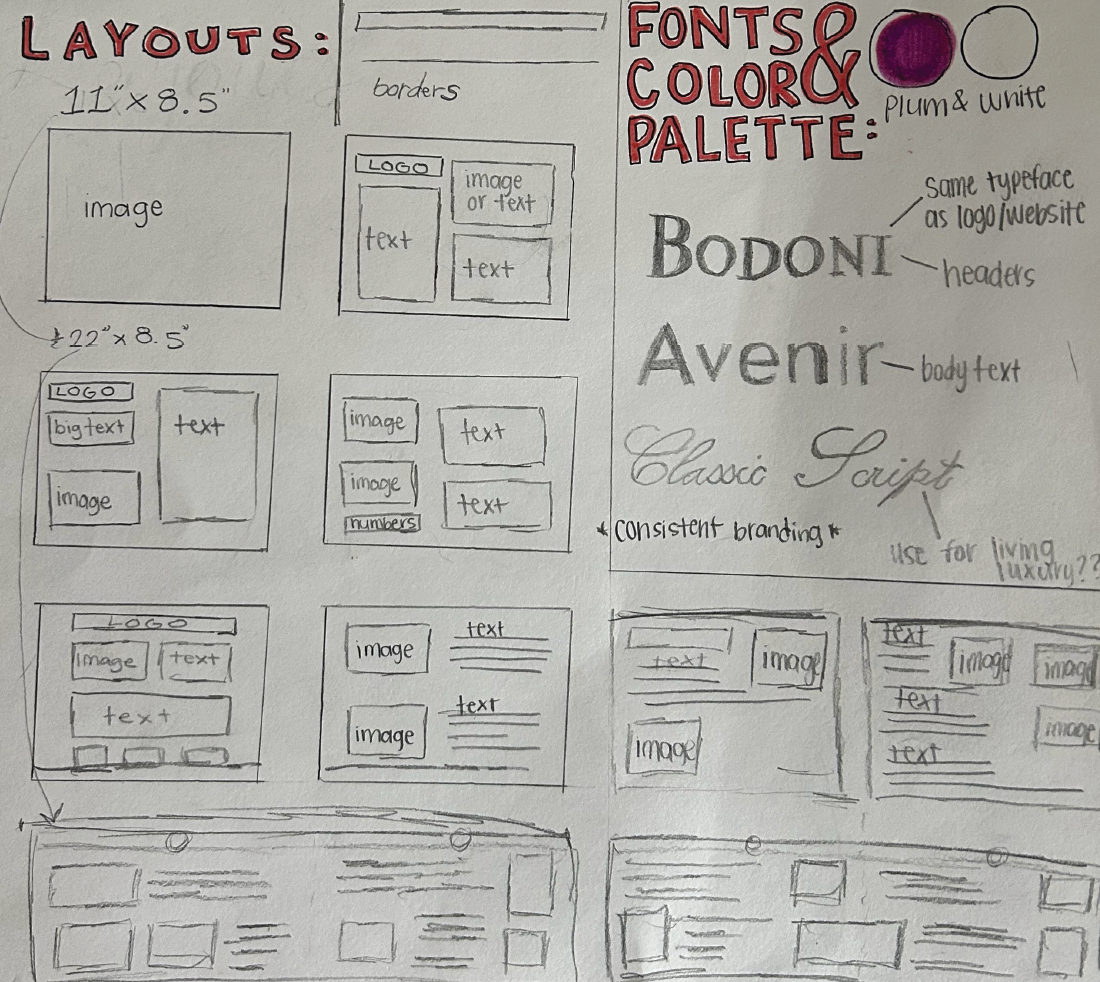
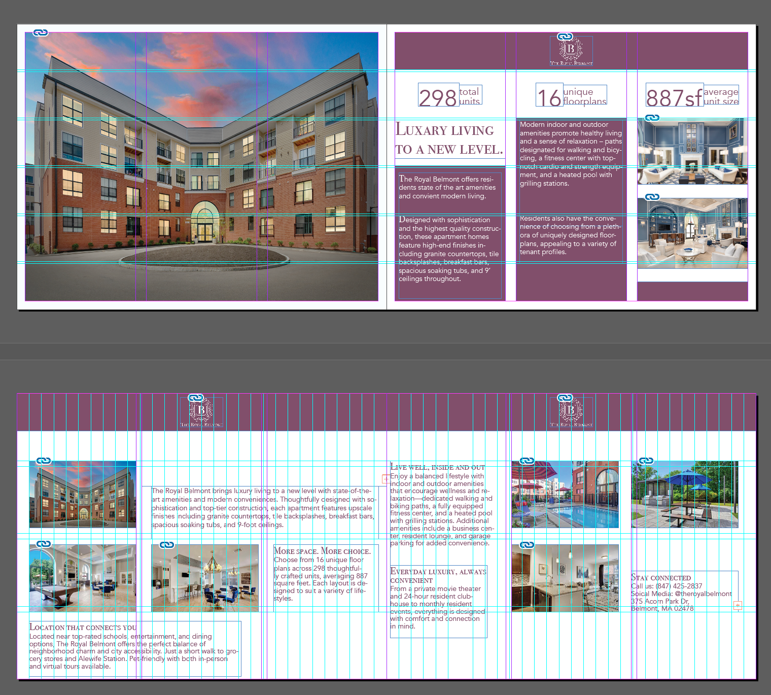
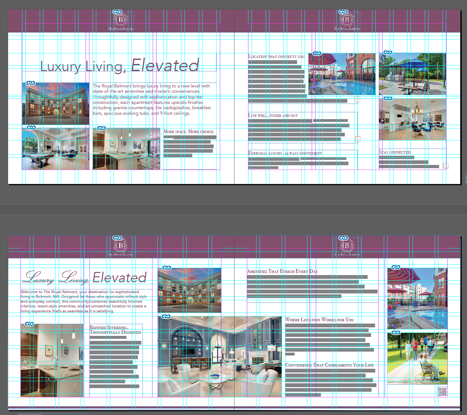
Layout Development
Concept
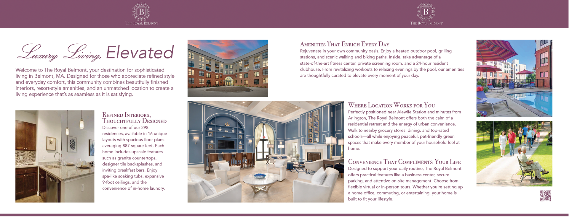
My concept for The Royal Belmont magazine spread was to stay aligned with the existing branding. I chose a clean, bright look by using their signature plum and white color palette, which feels both elevated and welcoming. For typography, I selected Bodoni for headers and Avenir for body text—both closely resemble the typefaces used on their website. I also incorporated Classic Script Italic for “Living Luxury” to reflect the elegance and movement seen in the swirly design around the “B” in their logo. To visually communicate the experience of living at The Royal Belmont, I included an exterior photo of the property—offering a warm first impression and inviting readers to learn more. Based on my research, I highlighted key amenities such as the private screening room, 24-hour resident clubhouse, walking and biking paths, close proximity to grocery stores, and easy access to Alewife Station. Supporting imagery includes shots of the pool, clubhouse, a kitchen with the backsplash and breakfast bar, and people enjoying the nearby walking paths. Together, these design choices were made to visually capture the comfort, sophistication, and lifestyle offered by The Royal Belmont, while staying true to the brand’s voice and aesthetic.
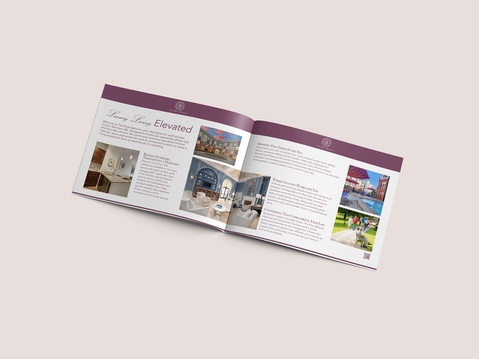
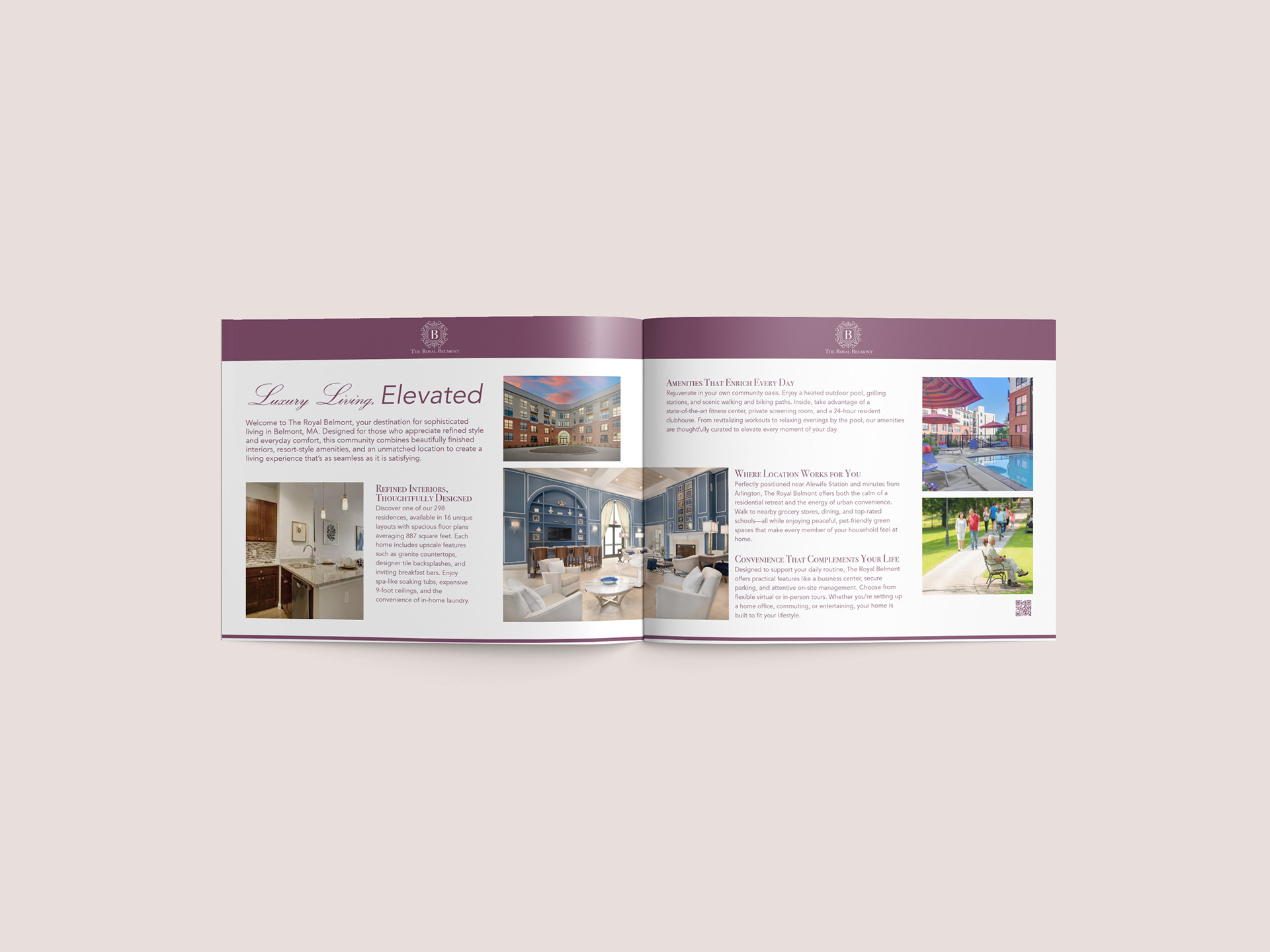
The Final Design